Register For Our Mailing List

Register to receive our free weekly newsletter including editorials.

Home / 89

Who wins? Australia versus US in local shares

I am often asked how returns from shares have compared between the stock markets in Australia and the US. This topic came up again in a Cuffelinks story from last week so I have updated one of my favourite charts. It shows total returns (including reinvested dividends) after inflation from Australian and US stock markets since 1900.

Specifically, the first chart shows real total returns from the broad Australian stock market in Australian dollars after Australian CPI inflation (the green line) versus real total returns from the broad US stock market in US dollars after US CPI inflation (red line). Thus it compares how Australian investors have fared from their local Australian market in their local currency after local inflation, versus how American investors have fared from their local market in their local currency after local American inflation.

Therefore this compares the returns from the point of view of two different investors: an Australian in Australian equities versus an American investor in US equities. (In Part 2 we look at whether Australian investors would have done better investing in Australian shares rather than in American shares).

(This graph can be enlarged by clicking on it).

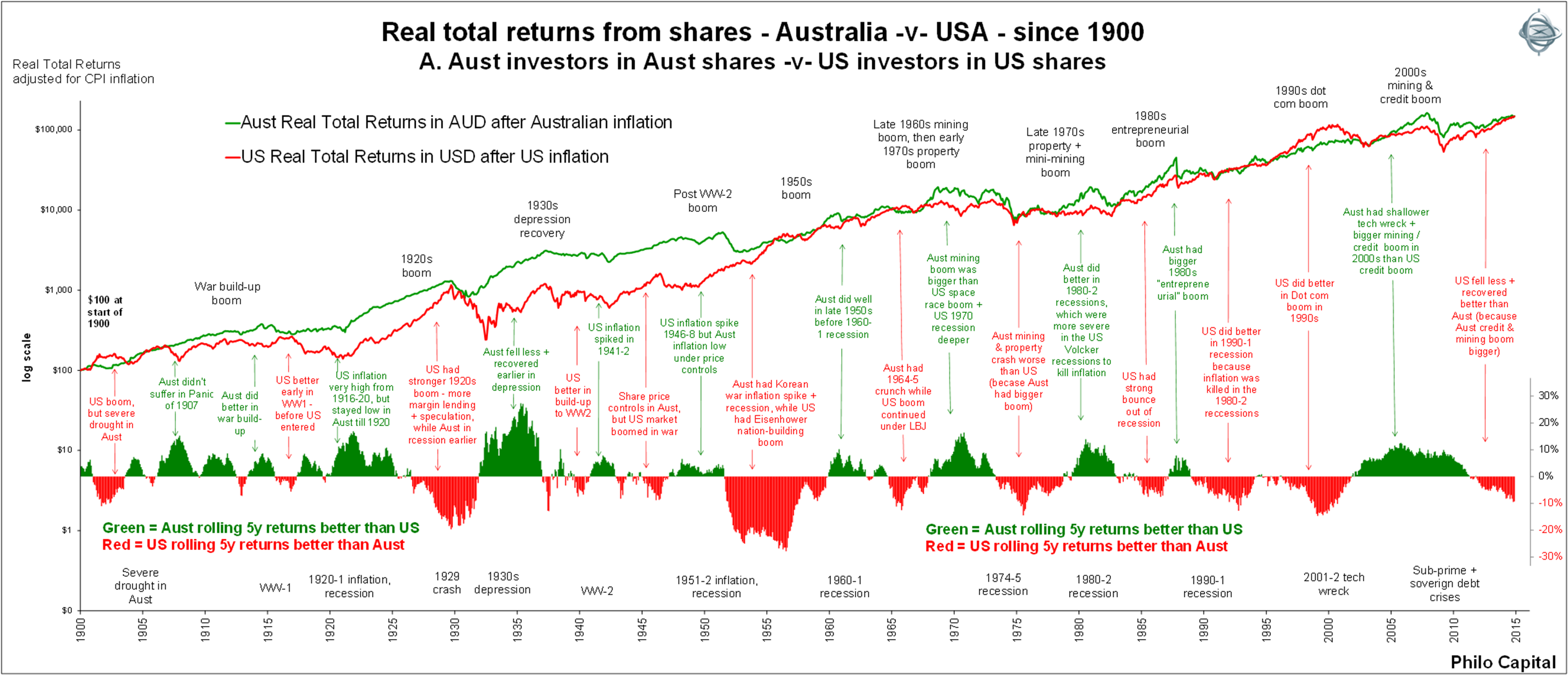
Returns the same from both markets since 1900

The above chart shows total returns to Australian investors has been virtually the same as American investors have received (in local markets, currencies and inflation). A$100 invested by an Australian investor at the start of 1900 would have turned into A$148,000 today (end of October 2014) and US$100 invested by an American investor in US stocks would be worth about US$148,000 today.

For American shares we use the S&P500 index with dividends re-invested, and for Australian shares we use the All Ordinaries index (and its predecessors) with dividends re-invested. These returns are before tax and brokerage costs. Tax rates and tax rebate regimes have changed many times in each country, and tax benefits from franking in the Australian market since 1987 would probably be more than outweighed by the impact of buy-backs in the US market. We also assume investors have been ‘long-only’ in each market. That is, they have not used margin lending or any other type of gearing or derivatives that wiped out many investors in the more extreme booms and busts along the way. It also assumes investors don’t panic buy in booms, nor do they panic sell in busts. They just hold on, re-investing dividends and adjusting holdings to stick with the index weights of each company.

Alternating booms and busts

Although the total returns have been same, there have been large differences for long periods at a time.  Australia and America have taken turns at having bigger booms and bigger subsequent busts.

The lower section of the first chart shows the difference between rolling five year returns. This neatly illustrates how the pendulum has swung between Australian shares beating US shares (green vertical bars above the line in lower section), and US beating Australian shares (red vertical bars below the line).

The green and red text boxes across the middle of the chart highlight the booms and busts:

  • In every second cycle the Australian market did better than the US market (green boxes).
  • But between each of these periods the US market did better than Australia (red boxes).

Working backwards over time we see this pattern repeated throughout the past century:

  • In the most recent big boom during 2003-2007, the Australian stock market generated higher returns than the US market because Australia had both a credit boom and a mining boom at the same time.
  • The US didn’t have such a big 2003-2007 boom so the US didn’t have as far to fall, and has done better than Australia since the 2008-2009 bust.
  • However the US market did much better in Australia in the late 1990s ‘dot-com’ boom, but it subsequently fell further than Australia in the 2001-2002 ‘tech wreck’.
  • Following the same pattern, the Australian market did much better in the 1980s ‘entrepreneurial’ boom, but then fell further in the 1987 crash that followed.
  • Further back, Australia did much better in the early 1980s recession, because the US was hit with the full ‘Volcker’ double dip recessions to kill inflation. Australia rejected monetarism and instead relied on the ‘Accord’ process to partially control inflation, and did not have the big inflation-busting recession until a decade later (Keating’s ‘recession we had to have’) in 1990-1991, when US shares did better.
  • This pattern where Australia and the US took turns to have a big boom followed by a big bust goes all the way back for more than a century – even through world wars, recessions, the depression, inflation spikes and political crises – and each is noted on the chart.
  • The biggest bust in the Australian market was in 1973-1974 (worse than the 2008-2009 GFC). It came after a double-barrelled boom – a speculative mining boom in the late 1960s followed by a speculative property bubble in the early 1970s. The Australian market rose higher than the American ‘space race’ boom at the same time, but then had further to fall.
  • Further back still, the 1920s boom was much bigger in the US, fuelled largely by US margin lending and speculation. Australia did not have the same penetration of margin lending and was already in recession in the late 1920s well before the 1929 crash. Because the US boom in the 1920s was much higher, it crashed further.
  • This pattern of baton-changing extended back even before 1900. Before the ‘panic of 1907’ in the US, Australia had a larger 1880’s boom because it was not just a banking/property boom but a mining boom as well. Consequently our early 1890s property and banking collapse was worse.

Given the remarkable consistency of this pattern, it is tempting to say that, because the last boom/bust was bigger in Australia than the US (the 2003-2007 boom and subsequent 2008-2009 bust), it is America’s turn for the next big boom/bust. Only time will tell.

Structural similarities and differences

The fact that both markets have generated similar returns from their stock markets over long periods is no great surprise. There are some important similarities but also some key differences.

Both are pluralist democratic former British colonies with relatively strong political, administrative, social and judicial institutions, rule of law and protection of private property rights, civilian control of the military, and both economies have grown by a little above 3% per year over the past century. Importantly, both countries have managed to stay out of destructive all-out wars against foreign powers on their own soil, and both have also avoided revolutionary changes in power and wholesale confiscation of private assets.

One key difference is the source of economic growth. Only one-third of American economic growth has come from population growth (more people producing the same output per person) while two-thirds of the growth has come from productivity growth (more output per person), but it has been the reverse in Australia. Two-thirds of Australian economic growth has come from population growth (more people doing the same old things), while only one-third of the growth has come from productivity growth (doing things better per person).

Difference in sources of returns

Another difference is the components of returns. The following two charts show returns from Australian shares (left chart) and US shares (right chart) broken into their component parts: dividends, price growth and inflation.

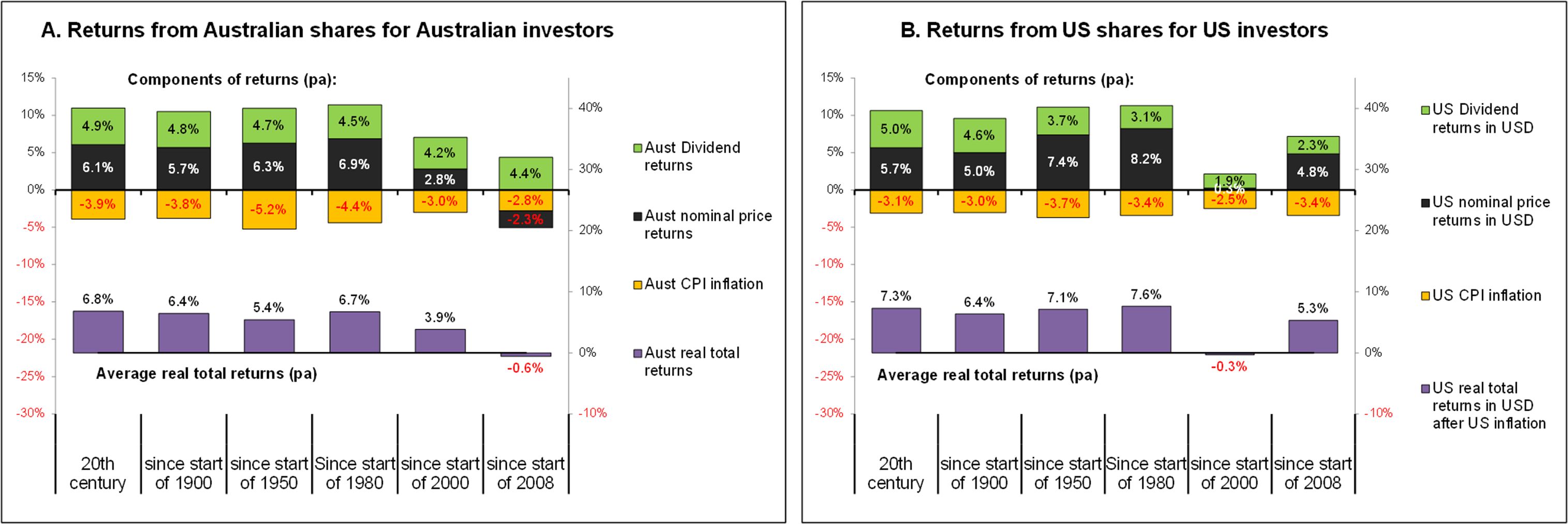
The purple bars on the lower section of the charts show total real returns over various periods. Both markets have generated total real returns of around 6% to 7% per year averaged over very long periods.

However, Australian companies have generated higher dividends and higher nominal price growth but Australia has suffered higher inflation. Higher dividends are a function of our market being a couple of hundred years younger than the American market. In younger markets investors demand quicker returns and allow boards to retain less for future growth. (In the US market’s first century US companies also generated near 100% dividend payout rates, much like Australian companies did in the Australian market’s first century). More recently, since 1987, the existence of franking credits on dividends in Australia has also led to higher dividends and less re-investment of earnings. In recent years the market structure in the US has favoured share buy-backs which have contributed an additional 2% to 4% to dividend returns (far exceeding the benefit of franking credits on Australian dividends, which has added around 1% to 1.3% to returns).

So to answer the question: “Which market has generated higher real total returns for local investors?”, the answer is: “It’s a dead heat” - although there has been a consistent pattern of the pendulum swinging between Australia and the US for more than a century.

Part 2 of this story will consider whether Australian investors have received better returns from the Australian or US market after accounting for differences in inflation rates and exchange rates.


Ashley Owen is Joint CEO of Philo Capital Advisers and a director and adviser to the Third Link Growth Fund. This article is for general educational purposes and is not personal financial advice.


26 Comments
Mark Shepherd
December 31, 2023

Hi Ashley. This article from 2014 is one that I keep coming back to whenever I get the jitters about the wisdom of investing in Australian shares. It would be a great service if you could update the article to incorporate the data since 2014. I've attempted to do it myself but I lack easy access to data on total returns, inflation and exchange rates. Please, please!

Capital Markets Guy
November 29, 2014

While it is intellectually interesting to discuss index composition etc, I would be more interested in the hedged and unhedged returns on US stocks for Australian investors as it is (virtually) impossible to obtain local market returns for Australian-based investors.

Other issues of interest:
* the inclusion of the value of franking credits (about 1.5% p.a. for eligible Australian investors since the late 1980s)
* the cost of managing such portfolios over time
* likely income and capital gains taxes (we can only eat after-fees, after taxes returns)

It should also be noted that, back in 1900, Australia and America were more like "emerging market" stock markets than the established doyens that we are familiar with now, and their future returns are unlikely to reflect that marvellous time in the future. At least IMHO.

Elroy Dimson
November 29, 2014

Australian stock market data is re-examined by Simon Wheatley and Brendan Quach, in “The Market Risk Premium: Analysis in Response to the AER’s Draft Rate of Return Guidelines”, NERA Economic Consulting, October 2013. On pages 46–50, they compare the Dimson, Marsh and Staunton (“DMS”) data with the Brailsford, Handley and Maheswaran (“BHM”) data. In their Executive Summary, they write as follows:

“DMS (2012) and BHM (2012) provide two different estimates of the long-run mean return to a value-weighted portfolio of Australian stocks. In their Credit Suisse Global Investment Returns Sourcebook 2013, DMS report that the arithmetic mean of the annual return to a value-weighted portfolio of Australian stocks, exclusive of imputation credits, from 1900 to 2012, is 13.0 per cent. The arithmetic mean of the series of annual returns to a value-weighted portfolio of Australian stocks that BHM supply and that we update, exclusive of imputation credits, from 1900 to 2012, is 12.0 per cent. Thus the arithmetic mean of the series of annual returns that BHM supply is 100 basis points below the arithmetic mean of the series that DMS use.

“The difference between the two arithmetic means is primarily explained by differences in the way in which the dividends distributed by a value-weighted portfolio of stocks were determined by those who provided the data to the two sets of authors. DMS (2013) use a series of dividend yields provided to them by Officer that is largely based on a series produced by Lamberton (1961). BHM (2012) use a series of yields provided to them by the Australian Stock Exchange that is also largely based on Lamberton’s data. The yields that BHM use, however, have been adjusted downwards to take account of perceived deficiencies in the series that Lamberton provides.

“We assess whether the adjustment to Lamberton’s yield series in the data that BHM employ is warranted and provide evidence that it is not. The evidence suggests that some adjustment should be made but that the adjustment should be smaller than the adjustment made in their data. An estimate of the downwards bias generated by inappropriately adjusting Lamberton’s yield series is 18 basis points for the period that DMS examine, 1900 to 2012.”

===============================

To summarise, as we have written, BHM identified shortcomings in pre-1958 Australian stock-return data. However, they appear to over-compensate for these shortcomings. That is why we have not switched to a replacement index series for Australia.

As for Andex, we have no information about their underlying data sources. For historical research, we favour index data that has passed academic scrutiny. There is still a need for more authoritative research on long-term Australian stock market performance.

Peter Lang
December 05, 2014

Elroy Dimson,

Thank you. Much appreciated and very informative.

"Thus the arithmetic mean of the series of annual returns that BHM supply is 100 basis points below the arithmetic mean of the series that DMS use."

"An estimate of the downwards bias generated by inappropriately adjusting Lamberton’s yield series is 18 basis points for the period that DMS examine, 1900 to 2012.”

Can I take this to mean the first sentence I quote if corrected would read:

"Thus the arithmetic mean of the series of annual returns that BHM supply [,once corrected, would be 82] basis points below the arithmetic mean of the series that DMS use." ?

Elroy Dimson
November 28, 2014

Here is the documentation for the DMS data series. A comparison with alternative data series follows this comment:

==========================

From: Elroy Dimson, Paul Marsh and Mike Staunton "Global Investment Returns Sourcebook 2014", Zurich: Credit Suisse Research Institute, February 2014.

CHAPTER 5

Australia

The data for equities were provided by the author of Officer (1989). He uses Lamberton’s (1958a,b) data, linked over the period 1958–74 to an accumulation index of 50 shares from the Australian Graduate School of Management (AGSM) and over 1975–79 to the AGSM value-weighted accumulation index. Subsequently, we use the Australia All-Ordinary index. Brailsford, Handley, and Maheswaran (2008) argue that pre-1958 dividends are overstated by Lamberton, but do not present alternative annual dividend estimates, and we continue to use Officer’s dataset.

Bond returns are based on the yields on New South Wales government securities from 1900–14. For the period 1915–49, the yields were on Commonwealth Government Securities of at least five years maturity. During 1950–86, the basis is 10-year Commonwealth Government Bonds. From 1986–98, we use the JP Morgan index of Australian government bonds with seven or more years to maturity, switching in 1999, once data became available, to the JP Morgan index of Australian government bonds with ten or more years to maturity.

For 1900–28, the short-term rate of interest is taken as the three-month time deposit rate. From 1929 onward, we use the treasury bill rate.

Inflation is based on the retail price index over 1900–48 and thereafter on the consumer price index.

The switch in 1966 from Australian pounds to Australian dollars has been incorporated in the Exchange Rate index history.

Peter Lang
November 28, 2014

When is Part 2 going to be posted?

" (In Part 2 we look at whether Australian investors would have done better investing in Australian shares rather than in American shares)."

Graham Hand
November 28, 2014

Expected next week. Ashley's articles take time but they're worth waiting for.

ashley
November 27, 2014

Great to hear from you Messrs D, M & S!
yes I find index construction very tricky - particularly with older data with scant records. In Australia we had several exchanges, and several different indexes and aggregations, some done at the time and some done many decades later. Much comes down to which composites to include - eg most people use old ASX index data which pre-1936 is based on the Sydney Commercial Index, but that excludes financials and miners (which are the bulk of stocks, and attracted most public interest + investment) and also excludes other exchanges, etc.

Another issue is how to treat the various weighting methods used at various times at sector and index levels. Another big issue is how to treat the Lamberton adjustments. Given the problems I tend to use old index data mainly for broad comparisons only, and not detailed analysis.
A separate issue for real returns is which inflation/deflator series to use, particularly with older data.

I spent hundreds of hours in the old ASX library in Melb in the 1990s but they sold their data and index business to S&P which seems to have lost or destroyed much of the old records and source docs. S&P don't seem to know the origins of their own data (!)

+On US returns, for these types of purposes I tend to use S&P500 since inception, then before that the S&P Composite since inception (adjusted a bit), or S&P Composite since inception, then the Shiller/Yale S&P series before that (adjusted a bit). Cowles is also useful for older data.

ps - we are trying to keep footnotes and copious references out of Cuffelinks articles to keep them more or less readable to the general public. But certainly happy to receive your comments and suggestions.
cheers
ashley

Elroy Dimson
November 26, 2014

Our policy is to adopt the best index data, and only occasionally do we get involved in compiling non-UK index series; we have not developed any Australian indexes. We publish our data sources in the Global Investment Returns Sourcebook. Maybe there are better sources for Australia, or maybe our critics are in error. Like us, your author uses the Australian All Ordinaries (which started in 1980) and “its predecessors”. But evidently our choice of predecessor index series differs from some of your correspondents. We would therefore like you to put us in touch with those who are critical of our choices for Australian data. We would be interested to know their underlying data sources.

Best wishes from Paul Marsh and Mike Staunton,

Elroy

PS: The difficulty is imprecision in index descriptions. You can see that even for the US in the original article, which uses data from “the S&P 500”. The S&P 500 that did not exist before 1957 and there were no S&P indexes whatsoever before 1923. So some numbers have been employed for which the origin is unclear.

Peter Lang
November 27, 2014

Elroy Dimson,

It's great to have your comment here. Thank you. I've learnt a great deal from your book "Triumph of the Optimists: 101 years of global investment returns", year books and and articles.

This is one data set for Australia you are probably already aware of:

Brailsford, Handley and Maheswaran, 2012, "The historical equity risk premium in Australia: Post-GFC and 128 years of data"
http://epublications.bond.edu.au/cgi/viewcontent.cgi?article=1594&context=business_pubs

I've been wanting to ask you something for a long time. Have you compared the data you use for Australia with the data Andex uses for Australia? Does Andex use the same data source as you? If not, how different are yours and their data for Australia?

Andex Charts Pty Ltd, ‘The Andex Chart for Australian Investors’
http://www.andex.com.au/andex_chart

ashley
November 25, 2014

Stock buy-back offers are generally made to all shareholders - they can choose to accept in respect of all or part of their shares, or none. If they accept they get the cash. If they don't, they get the benefit of owning a greater share of company's outstanding shares (in the order of 3-4% higher each year aggregated for the whole market), so they get proportionally higher eps and dps in future.
This higher eps growth + dps growth is ultimately (but not necessarily immediately) reflected in share price growth being proportionally higher. In a sense the 3-4% benefit each year is a DCF of future higher dividends since remaining shareholders own more and more of the dividend pie each year.
Either way the benefits flow to shareholders whether they are US citizens or foreigners (withholding tax is generally rebated from tax paid in Australia). Each fund manager and EFT manager would have their own policies regarding buy-backs. Active managers generally are quite active in the space but I suspect ETF managers have passive rule-based approaches to buy-backs but you would need to check with them.
Hope this helps.
Ashley

Peter Lang
November 27, 2014

Ashley,

Thanks you again. Unfortunately, I am still not clear on the impacts of the buybacks for Australian investors investing in the index (which is what your article is about). Am I correct to interpret your comment to mean that the effect of the buy backs is already included in the S&P500 index? if so, the effect of the buybacks is already included in the S&P500 index tracker ETFs. Therefore, an Australian investing in the S&P500 index will get the returns shown in your chart (less fees) and nothing more. Whereas and Australian investing in an ASX200 or ASX300 index tracker gets the return in your chart above plus the imputation credits.

Peter Lang
November 25, 2014

Ashley, thank you for your response.

"US dividends buybacks are running at around $80b per quarter (giving a div yield of around 2%) but cash buybacks are running at more than $100b per quarter, giving an additional cash yield of around 3% on top of cash dividends. This is an immediate cash benefit to investors (instead of having to wait till next year to get a tax refund of franking credits in Australia). Buy-backs also carry tax benefits in the US (depending on the investor).

Buybacks in the US are the rule rather than the exception (eg more than 300 companies in the S&P500 index are buying back shares). Since 2007, US companies have paid out more than $3 trillion in buybacks, which is 50% more than the $2 trillion they have paid in total cash dividends over the period.

For the remaining shares not bought back, buy-backs would increase the earnings per share and dividends per share in future years because there are fewer shares on issue after buybacks. True there are some Australian companies that have bought back shares, but they are the exception rather than the rule here.

In relation to how ASX-listed ETFs handle buybacks – eg how they choose to participate, how they are treated for tax purposes, withholding tax, etc – you would need to ask them directly. My guess is they should treat them as realised capital gains since they are proceeds for buying shares."

Ashley, thank you. However, I am still unclear of the relevance of the US buybacks for Australian investors investing in US S&P500 through index ETFs or index funds [Your chart refers to an investor who invests in proportion to the index]. I am hoping you will make this clear in your follow up post where you compare the returns for an Australian investing in ASX200 or ASX300 compared with investing in the US S&P500 index tracker.

The reason I ask is because your post above suggests that the US buy backs are a bigger boost to returns than imputation credits. Imputation credits are only for Australian and NZ residents. But can an Australian investor in the S&P500 index get the benefit of them.

Put another way, are the buy backs included in the S&P500 accumulation index or not? Imputation credits are not included in the ASX200 and ASX300 accumulation index so they give a boost to the returns to the Australian indexes. I suspect that is not the case for an Australian investing in the S&P500 index.

If I am correct, I think it's important to point out that an Australian investing in an index tracker fund or ETF would not get the benefit of the buybacks; therefore Australia's imputation credits give a distinct advantage to the Australian investing in the ASX200 or ASX300 index..

For the Australian to get the benefit of the US buybacks two things have to happen:

1. he has to pick stocks in the S&P500 index (instead of invest in the index) and consistently beat the index - we know that few investors achieve that

2. He has to receive the same value of the buybacks as a US citizen receives.

Jonathan Hoyle
November 24, 2014

Fascinating article, Ashley, as always. It would be interesting to see the results for other Anglosphere countries such as NZ and Canada. Is common law, parliamentary democracy and the sanctity of property rights the defining features of great returns?

I have to agree with jerome above, though. Is Australia's productivity really so poor? And just how important is population growth to stock returns? If so, we should all sell German and Japanese shares and buy countries with high population growth rates. It doesn't quite seem intuitive.

Look forward to part 2.

ashley
November 24, 2014

On comments relating to possible valuation differences between the Australian and US markets over the period –
There are many different measures you could use to measure value (most of which are difficult with very old data).
Just taking trailing dividend yields as a measure of pricing/value paid for cash dividends:
In Australia the Sydney Commercial Index was trading on a trailing dividend yield of 5.2% in 1900, and the All Ords index is now at 4.2%, so that amounted to pricing relative to cash dividends being 24% higher now than in 1900. The S&P index in the US went from a trailing dividend yield of 3.5% to 2% over the same period, which is a 75% expansion of pricing relative to US dividends.
But the lower dividend yields in the US are mostly explainable and justified by their higher dividend re-investment rate (which fuels future earnings growth). US companies retain 60-70% of their earnings to fund future growth or buy-backs, compared to just 20-25% in Australia, so this is reflected in the higher dividend yields required here.
On the basis of price/earnings ratios: No index data is available for Australia for 1900, but the US S&P index was trading at 13.5 times trailing four quarter earnings in 1900. Today both markets are trading on trailing PERs in the high teens, so both appear moderately over-priced on the simplistic PER measure. (Remember that US companies retain much more of their earnings for future growth so the US market structure allows a higher fundamentally justified PER before it becomes over-priced" on this measure).
Therefore there is probably no big differences between Australia and the US markets due to differences in pricing/valuation changes over the period.
Cheers
ashley

ashley
November 24, 2014

Further to a couple of comments and questions regarding buy-backs by US companies versus franking credits in the Australian companies -

US dividends buybacks are running at around $80b per quarter (giving a div yield of around 2%) but cash buybacks are running at more than $100b per quarter, giving an additional cash yield of around 3% on top of cash dividends. This is an immediate cash benefit to investors (instead of having to wait till next year to get a tax refund of franking credits in Australia). Buy-backs also carry tax benefits in the US (depending on the investor).

Buybacks in the US are the rule rather than the exception (eg more than 300 companies in the S&P500 index are buying back shares). Since 2007, US companies have paid out more than $3 trillion in buybacks, which is 50% more than the $2 trillion they have paid in total cash dividends over the period.

For the remaining shares not bought back, buy-backs would increase the earnings per share and dividends per share in future years because there are fewer shares on issue after buybacks. True there are some Australian companies that have bought back shares, but they are the exception rather than the rule here.

In relation to how ASX-listed ETFs handle buybacks - eg how they choose to participate, how they are treated for tax purposes, withholding tax, etc - you would need to ask them directly. My guess is they should treat them as realised capital gains since they are proceeds for buying shares.

On a broader note, companies can be categorised as one of two types - those that suck in cash and those that spin off cash. The bigger picture at play here is the fact that Australia is still a relatively young emerging market in the sense that it is (and always has been) a big capital importer. Australian companies are forever raising capital to fund expansion and development. Australia has never had a savings pool large enough to fund its investment opportunities, so it has always had to import capital. So was the US up until the end of the 19th century. (it's capital came mainly from Britain, Netherlands, Germany, France - the "old countries")
But the US since the start of the 20th century has been a big capital exporter and US companies in aggregate spin off cash, reflecting in the relative maturity of the US economy and the US stock market. Even relatively new US companies like Apple, Microsoft, Google, etc have reached global dominance relatively quickly and are now spinning off or hoarding trillions of dollars in cash.

The great conundrum is that Australian companies (being young, growing and always needing capital to invest in new projects) should in theory generate higher returns than US companies (being mature, spinning off cash, reaching limits to growth). But that has not been the case in aggregate. For every 100 bio-techs floated in Australia only a couple make it big. For every 100 mining explorers floated here only a couple strike it rich, etc. The rest of the capital is squandered. Even at the big end of town, most acquisitions are ego-driven and destroy shareholder value. In aggregate, real total returns from Australian listed companies have been more or less the same as for US listed companies.

cheers

ashley

Peter Lang
November 23, 2014

Ashley Owen,

Thank you for informative article. And also for your comment revealing the discrepancies in the Dimson et al data. A friend and I have compared the Dimson et el. real returns from Australian shares with returns published by Andex and by Brailsford et al.. We have have higher confidence in the Andex data and the Brailsford et al data than in the DMS data. I have a question regarding Australian investors investing in Australian ASX200 or ASX300 index versus US S&P500 Index. My question is about the boost to returns from the Imputation credits versus the return from US share buybacks for Australian investors

In short, For an Australian investor, what is the mean (or median) boost to real returns from shares from imputation credits in Australia versus US share buybacks for an Australian in SMSF in pension phase (not tax on SMSF earnings) investing in either:

1. ASX200 or ASX300 index through an ETF such as STW or VAS, OR

2. S&P500 index through ETF such as IVV.

Barry
November 23, 2014

How about the returns more recently (since the GFC), is there value in holding both?

Michael McAlary
November 23, 2014

Good article Ashley and further good comments by all. A further analysis that may shed some light on the difference performance (and as you touched on it briefly when you mentioned the sources of productivity changes and in your comments) would be a comparative segmentation analysis over the same time period. About 2 years ago we examined the segmentation breakdown of the two economies using the S&P 500 index and ASX All ordinaries index. We found that in 1980 the USA and Australian economies were very similar. Namely, the economies were dominated by the resource and industrial companies. Over the last 30 years the USA has become a technology driven economy, e.g. Apple, Microsoft, Google, Facebook, Twitter plus many others all of which either did not exist or were in their infancy. Whereas, the Australian economy is now dominated by financial services companies who are meant to be mobilisers of capital not wealth producers in their own right. For the imbalance to be removed the financial services sector in Australia must shrink and new sectors and industries grow to remove the imbalance.

Geoff Walker
November 22, 2014

The 1951 return issue might simply be a case of financial year vs calendar year. My data has the Aussie accum index returning 35% for that financial year, consistent with the real return you quote for the DMS data, although my index values are the month-average rather than the month-end.

Rob
November 21, 2014

Thanks for the thorough and interesting analysis.

I don't understand the calculation of the returns in the following sentence.

In recent years the market structure in the US has favoured share buy-backs which have contributed an additional 2% to 4% to dividend returns (far exceeding the benefit of franking credits on Australian dividends, which has added around 1% to 1.3% to returns).

I thought the effect of buybacks is reflected in the future share price and dividends of the stock therefore there is no additional benefit. Whereas the franking credit is a real extra benefit.

A third scenario which would be interesting to investigate is assuming that dividends are not reinvested. That is measure the returns from shares and add the dividend return.

ashley
November 21, 2014

hi Jerome,
some interesting questions. Living standards numbers are a bit misleading. On the basis of current dollars Australian living standards are virtually on a par with the US - depending on the exchange rate from time to time.

But on PPP-adjusted basis (which I use for these types of analysis), our living standards are about 20-30% lower (because our AUD is over-valued).

But at a practical level, our actual living standards are probably around half of those in the US - why? because just about everything I can think of costs twice (or more) here what they cost to the average US consumer - food, coffee, clothing, housing, cars, gadgets, insurance, electricity, gas, petrol, wages, books, and just about all services I can think of (because services involve wages) - pretty much everything, so the buying power is actually more like half of the US level. Some things look cheaper here (eg visit to the doctor) but only because they are subsidised by tax-payers so the real costs are hidden.
Readily imported things like clothes, books, etc are coming down in price thanks to on-line retailing, but everything else is still horrendously expensive here


Differences in productivity are fascinating and worthy of much discussion and debate. But the bottom line is that Australia hasn't progressed far beyond mainly exporting dumb rocks so other people in other countries can make useful things out of them - which we import back at many thousands of per cent mark-up on the price received from exporting our dumb rocks.

Asian factories turn our dumb rocks into nice looking but useless boxes (phones, laptops, TVs, computers, etc without software).
But those boxes then become useful and valuable only thanks to software and brainpower - and those are mainly US companies - Apple, Google, Intel, Microsoft, Oracle, IBM, Amazon, eBay, Facebook, Cisco, etc, etc.
Oh yes we also "export" tourism - foreigners coming her to look at our dumb rocks, funny looking animals, nice beaches, etc. We didn't invent them, create them, design them - we just tripped over them! Natural resources are more a curse than a blessing. But that's a whole other debate for another day!
cheers


ashley

James
April 24, 2017

Great comment Ashley- totally agree

ashley
November 21, 2014

Yes I have the DMS data and many people appear to use it and rely on it. But there are some major discrepancies in it - mostly in the older data. There are some huge differences that I have been unable to reconcile with my data after hundreds of hours work on it.

Eg take calendar 1951. DMS show real total returns for Australian equities as +14.9% in 1951 but that is simply absurd.

In 1951 the Sydney "Ordinaries" index (the most widely used broad index) fell by 15%. It was the worst year in nominal terms since 1941 (it rallied during the Korean War wool price boom up to 7th May and then collapsed to year end as commodities prices collapsed).
But it was even worse after inflation.
1951inflation was also the highest since 1900 - the CPI inflation index rose 19.3% during the year in the Korean war inflation spike.
All of the big stocks were down in 1951: BHP down 18%, CSR down 19%, Bank of NSW (now Westpac) down 19%, David Jones down 42%, Woolworths down 46%, etc. - all clobbered by falling commodities prices, high inflation and emergency tax hikes (including the Menzies "horror budget" to try to slow inflation)

Total real returns in 1951 were actually as follows:
- 15.5% nominal price return
+ 3.7% dividends
- 19.3% CPI inflation
= -31% ie a significant real loss (simplifying the maths for this illustration)

That is just one example of major discrepancies in the DMS data. There are many others - eg. 1902, 1904, 1914, 1920, 1923, 1929, 1931, 1935, 1937, 1941, 1942, 1943, 1972. Some appear to be a result of DMS using averaging and smoothing, but most of the big differences are a complete mystery to me.
It pays to question and double check everything

cheers

ashley

Rob Pereira
November 21, 2014

Interesting article, with some nice economic history.

One caveat; use a different data source and you get a different answer! Point in case is have a look at the Dimson, Marsh Staunton database, which covers the same time period, but uses a much broader index to measure the US market.

Interestingly the DMS data has $100 growing to $333,200 for Australia and $124,800 for the US. The annually compounded rate of return is 7.4% and 6.5% for Australia and the US, respectively. This compares with a growth rate of 6.6% for both Australia and the US based on the data in this article.

Now the puzzling thing is that there is a significantly different result for Australia but not the US. I wouldn't be so surprised if it was the US as the composition of the two indexes seems quiet different. But it is the Australian data that has the big difference.

Why?

Jerome Lander
November 20, 2014

Great article Ashley.

It is an interesting observation about the source of economic growth being significantly different and productivity growth being half as much in Australia!

Perhaps given living standards are similar, productivity growth really hasn't been as different as suggested? Has having resources really made that much difference (being the lucky country)?

If we have really been so unproductive why are the returns the same? Greater oligopoly power?

Is there some great latent potential in Australia to become more productive and produce better returns that the US?

As a separate point, it would be interesting to overlay valuations on this chart?


Leave a Comment:

RELATED ARTICLES

Who wins? Australians investing in US shares

Australian large caps outperform small caps over long term

Where do sustainable returns come from?

banner

Most viewed in recent weeks

2024/25 super thresholds – key changes and implications

The ATO has released all the superannuation rates and thresholds that will apply from 1 July 2024. Here's what’s changing and what’s not, and some key considerations and opportunities in the lead up to 30 June and beyond.

The greatest investor you’ve never heard of

Jim Simons has achieved breathtaking returns of 62% p.a. over 33 years, a track record like no other, yet he remains little known to the public. Here’s how he’s done it, and the lessons that can be applied to our own investing.

Five months on from cancer diagnosis

Life has radically shifted with my brain cancer, and I don’t know if it will ever be the same again. After decades of writing and a dozen years with Firstlinks, I still want to contribute, but exactly how and when I do that is unclear.

Is Australia ready for its population growth over the next decade?

Australia will have 3.7 million more people in a decade's time, though the growth won't be evenly distributed. Over 85s will see the fastest growth, while the number of younger people will barely rise. 

Welcome to Firstlinks Edition 552 with weekend update

Being rich is having a high-paying job and accumulating fancy houses and cars, while being wealthy is owning assets that provide passive income, as well as freedom and flexibility. Knowing the difference can reframe your life.

  • 21 March 2024

Why LICs may be close to bottoming

Investor disgust, consolidation, de-listings, price discounts, activist investors entering - it’s what typically happens at business cycle troughs, and it’s happening to LICs now. That may present a potential opportunity.

Latest Updates

Shares

20 US stocks to buy and hold forever

Recently, I compiled a list of ASX stocks that you could buy and hold forever. Here’s a follow-up list of US stocks that you could own indefinitely, including well-known names like Microsoft, as well as lesser-known gems.

The public servants demanding $3m super tax exemption

The $3 million super tax will capture retired, and soon to retire, public servants and politicians who are members of defined benefit superannuation schemes. Lobbying efforts for exemptions to the tax are intensifying.

Property

Baby Boomer housing needs

Baby boomers will account for a third of population growth between 2024 and 2029, making this generation the biggest age-related growth sector over this period. They will shape the housing market with their unique preferences.

SMSF strategies

Meg on SMSFs: When the first member of a couple dies

The surviving spouse has a lot to think about when a member of an SMSF dies. While it pays to understand the options quickly, often they’re best served by moving a little more slowly before making final decisions.

Shares

Small caps are compelling but not for the reasons you might think...

Your author prematurely advocated investing in small caps almost 12 months ago. Since then, the investment landscape has changed, and there are even more reasons to believe small caps are likely to outperform going forward.

Taxation

The mixed fortunes of tax reform in Australia, part 2

Since Federation, reforms to our tax system have proven difficult. Yet they're too important to leave in the too-hard basket, and here's a look at the key ingredients that make a tax reform exercise work, or not.

Investment strategies

8 ways that AI will impact how we invest

AI is affecting ever expanding fields of human activity, and the way we invest is no exception. Here's how investors, advisors and investment managers can better prepare to manage the opportunities and risks that come with AI.

Sponsors

Alliances

© 2024 Morningstar, Inc. All rights reserved.

Disclaimer
The data, research and opinions provided here are for information purposes; are not an offer to buy or sell a security; and are not warranted to be correct, complete or accurate. Morningstar, its affiliates, and third-party content providers are not responsible for any investment decisions, damages or losses resulting from, or related to, the data and analyses or their use. To the extent any content is general advice, it has been prepared for clients of Morningstar Australasia Pty Ltd (ABN: 95 090 665 544, AFSL: 240892), without reference to your financial objectives, situation or needs. For more information refer to our Financial Services Guide. You should consider the advice in light of these matters and if applicable, the relevant Product Disclosure Statement before making any decision to invest. Past performance does not necessarily indicate a financial product’s future performance. To obtain advice tailored to your situation, contact a professional financial adviser. Articles are current as at date of publication.
This website contains information and opinions provided by third parties. Inclusion of this information does not necessarily represent Morningstar’s positions, strategies or opinions and should not be considered an endorsement by Morningstar.